
Good UX design is not about making things look beautiful — it is about making them work intuitively. Whether you are building a mobile app, a SaaS dashboard, or a simple e-commerce checkout, the principles governing how humans perceive and interact with digital interfaces have been studied, tested, and validated across decades of research. This guide distills the most important ones into practical, actionable knowledge.
Many aspiring designers make the mistake of jumping straight into color palettes and typography. But the real leverage in design lives upstream — in the structure of choices, the placement of buttons, the familiarity of patterns, and the clarity of feedback. These are the concerns that determine whether a product feels effortless or frustrating, trustworthy or confusing.
In this comprehensive guide to user experience basics, you will learn the 10 most important UX laws and UX basics every beginner must understand. Each principle is explained in plain language, illustrated with real before/after UI mockups, supported by a real-world case study, and tied to concrete design decisions you can make today. By the end, you will also have two visual frameworks — a UX flow diagram and a user journey map — to help you apply these ideas to your own projects.
1. UX Law: Hick’s Law — Reduce Choices, Reduce Friction
The formal definition: Hick’s Law states that the time required to make a decision increases logarithmically with the number and complexity of available choices. The mathematical expression is RT = a + b log₂(n), where RT is reaction time, n is the number of stimuli, and a and b are empirically derived constants.
William Edmund Hick first described this relationship in 1952 after running experiments where participants had to respond to lights by pressing corresponding keys. The more lights there were, the longer it took — not linearly, but logarithmically. Even doubling the number of options does not double decision time, but it does meaningfully increase it, especially when the user is under cognitive load, distracted, or unfamiliar with the interface.
For UX designers, the practical implication is stark: every option you add to a screen imposes a small but real tax on the user’s attention and decision-making speed. Navigation menus with 12 items, product category pages with 40 filters, and dashboards crammed with 30 widgets all violate Hick’s Law — and users respond by leaving, making errors, or simply feeling exhausted.
How to Apply Hick’s Law in Your Designs
The most powerful technique is progressive disclosure — showing only what is necessary at each step, and revealing more detail only when the user asks for it. Onboarding flows benefit enormously from this: instead of showing all features on day one, introduce them contextually as users encounter relevant tasks. Checkout flows should ask for information in stages, not all at once. Navigation menus should prioritize the top four or five destinations and hide secondary pages under a “More” option or footer.
Another key technique is smart defaults. Pre-selecting the most popular plan, the most common shipping option, or the recommended setting removes the need for a decision altogether. Users who want something different can change it — but most will not, and that is exactly the point.
Key insight:
Your job as a UX designer is not to show everything — it is to show the right thing at the right time. Ruthless prioritization is not a limitation; it is an act of respect for your user’s attention.
Before & After: Navigation Menu
10 nav items — every visit starts with a paralysing choice
Services
About
Contact Us
4 choices + 1 clear CTA — instant orientation, fast action
Case Study
Netflix Onboarding: Hiding Plan Complexity
Netflix’s original plan-selection screen presented users with a dense comparison table of features spanning dozens of rows across multiple plans. The decision was cognitively demanding, and many users abandoned before completing signup. After redesigning the screen to show just three cards — with the most popular plan visually highlighted and pre-selected, and secondary feature comparisons hidden behind a toggle — the experience became dramatically more direct. The UX team observed a measurable lift in signup completion and a significant reduction in average time spent on the plan-selection step. The content had not changed; the presentation had. That is the power of Hick’s Law applied thoughtfully.
2. UX Law: Fitts’s Law — Make Targets Big and Close
The formal definition: The time required to move a pointer to a target is a function of the ratio between the distance to the target and the width of the target. Formally: T = a + b log₂(2D/W), where D is the distance to the target and W is the width of the target.
Paul Fitts published this model in 1954 after studying the precision movements of aircraft pilots. It is one of the most replicated findings in human motor research, and its implications for interface design are direct and practical: interactive elements that are large and close are faster and easier to hit, while elements that are small and far away are slower and more error-prone.
This is why Apple’s Human Interface Guidelines specify a minimum tap target size of 44×44 points, and Google’s Material Design recommends 48×48 density-independent pixels. When tap targets are too small — a common failure in early mobile design — users must slow down, reposition their finger, and retry on failure. This friction is especially acute for users with motor impairments, elderly users, and anyone using their phone in a moving environment.
Fitts’s Law and the “Infinite Edge” Effect
One of the most fascinating implications of Fitts’s Law is the concept of infinite-size targets: screen edges and corners. Because the cursor or finger cannot go past the edge of the screen, moving to the screen edge requires no precise stopping — you simply slam the pointer toward the edge and it stops. This is why macOS places its menu bar at the very top of the screen rather than at the top of each application window: it makes every menu item an infinitely tall target in the vertical direction. Designers working on web applications or custom desktop software can leverage this by anchoring primary navigation to screen edges on large displays.
Before & After: Add to Cart Button
Add to cart
+
22×22px icon button — fails on mobile, error-prone on desktop
Add to cart
Add to Cart
Full-width 52px button — easy to tap, impossible to miss
Case Study
Shopify Checkout: Button Sizing on Mobile Devices
Shopify’s UX research team conducted an extensive audit of mobile checkout abandonment across thousands of merchant stores. They found that “Place Order” buttons with a height below 44px had a measurably higher rate of accidental dismissals and mis-taps on iOS devices. Users would tap the button but land on whitespace below it, experience nothing happening, and assume either a bug had occurred or the server was unresponsive. Many tapped multiple times, leading to duplicate order submissions. After enforcing a minimum button height of 56px and stretching the primary CTA to full-width on mobile viewports, the overall mobile checkout completion rate improved substantially. The change required zero copy updates, zero redesign of the checkout flow — just bigger buttons. This is Fitts’s Law generating measurable ROI.
3. UX Law: Jakob’s Law — Leverage Familiar Patterns
The formal definition (Jakob Nielsen, 1999): Users spend most of their time on other websites and applications. They form expectations — mental models — based on how the majority of interfaces they have encountered work. They prefer your product to behave according to those expectations. When it does not, they experience frustration, confusion, and loss of trust.
This is not a limitation of users — it is a feature of efficient cognitive systems. The human brain is a prediction machine. It builds models of how things work and then applies those models to new situations. When a new interface matches the existing model, the brain does not have to work hard: it navigates on autopilot. When the interface deviates from the model, the brain must stop, notice the discrepancy, update its model, and try again. That extra cognitive work is friction — and friction kills conversion, increases errors, and erodes trust.
The Conventions That Exist for a Reason
The shopping cart is always top-right. The logo always links to the home page. The hamburger menu always appears in the top-left corner on mobile. The search field is at the top of the page, not at the bottom. Password fields always mask characters with dots. These are not arbitrary conventions — they are the accumulated result of billions of user interactions across thousands of products, over decades of iterative design. Violating them in the name of originality is a trade-off that almost always hurts more than it helps.
Jakob’s Law does not mean design should be boring or derivative. It means that the skeleton of your interface — the navigation structure, the placement of primary actions, the behavior of forms — should match what users already know. Save your creative energy for the areas that genuinely differentiate your product: your value proposition, your content, your visual brand. The interaction model is not the place to be a rebel.
Key insight for UX basics: Innovation in UX should be about solving genuinely new problems, not about reimagining the placement of menus. When in doubt, copy the pattern that every other app in your category uses. Familiarity is a feature, not a failure of creativity.
Before & After: Interface Layout Conventions
Login (center popup)
Non-standard layout forces users to re-learn basic navigation
Instant orientation — no learning cost for new visitors
Case Study
Snapchat’s 2018 Redesign Backlash
In February 2018, Snapchat rolled out a major redesign that fundamentally reorganised its core interface. Stories — previously accessed by swiping right — were moved to a new Discover section on the right side of the app. Friends’ content was mixed with publisher content in ways that confused long-term users. The camera, Chat, and Stories functions were relocated to positions that contradicted the mental model millions of users had built over years of daily use. The result was swift and severe: over 1.2 million users signed a Change.org petition demanding the old design be restored, Snapchat lost more than a million daily active users in the following quarter, and the company’s stock price fell significantly. Snap’s own earnings call acknowledged that the redesign had caused user confusion. This is the clearest large-scale demonstration of Jakob’s Law in modern product history. It is not that the new design was objectively inferior — it is that it violated deeply ingrained mental models held by its core user base.
4. Perceptual Psychology: The Gestalt Principles — Visual Grouping and Perception
The Gestalt principles are a set of perceptual laws first described by German psychologists in the early 20th century. They describe how the human brain automatically organises raw visual input into structured, meaningful patterns — even when those patterns are not explicitly drawn. For UX designers, mastering Gestalt means understanding how users will perceive your layout before they consciously analyse it.
The five most important Gestalt principles for digital interface design are:
Proximity — Elements placed close to each other are perceived as belonging together. This is why form labels must sit immediately above their input fields: if there is too much space between a label and its field, users associate the label with the wrong element. Spacing is not decoration — it is communication.
Similarity — Elements that look alike are perceived as being part of the same group. If your primary button and secondary button look identical, users cannot distinguish their relative importance. If your interactive elements look the same as your static text, users will not know what to click. Visual similarity signals belonging; visual difference signals distinction.
Closure — The brain fills in missing information to complete incomplete shapes. This is why progress indicators, partially visible carousels (showing the edge of the next card), and breadcrumb navigation work so well: users intuitively understand there is more beyond the visible boundary.
Continuity — The eye follows paths, lines, and curves naturally. Placing related items along a visual line — a horizontal row of feature icons, a vertical stack of form fields — creates a reading flow that guides attention without requiring explicit instruction.
Figure-Ground — Users naturally separate visual scenes into a dominant subject (figure) and a background (ground). Modal dialogs work because they separate the task at hand (figure) from the underlying page (ground, dimmed). Cards on a background surface leverage figure-ground to communicate interactivity and containment.
Before & After: Form Label Proximity
Password
Large gap breaks the visual association between label and field
Labels hug their inputs — cognitive grouping is effortless
5. Cognitive Science: Miller’s Law — Chunk Information for Working Memory
The formal definition: George Miller’s landmark 1956 paper “The Magical Number Seven, Plus or Minus Two” established that the average human working memory can hold approximately 7 ± 2 items at once. More recent research by Nelson Cowan has revised this estimate downward to approximately 4 chunks, but the core insight remains unchanged: human short-term memory has a hard limit, and designs that ignore this limit cause cognitive overload, errors, and abandonment.
The practical design technique derived from Miller’s Law is chunking — grouping related information into units that can be processed as a single item. Phone numbers are chunked into groups (0917-555-1234 is easier to read than 09175551234). Credit card fields split into four groups of four feel natural because we are used to reading card numbers that way. A form with 12 fields grouped into three sections of four each is far easier to complete than 12 ungrouped fields stacked in a single column.
Applying Miller’s Law to UX Design
Navigation menus should ideally contain no more than five to seven items before grouping under categories or sub-menus. Onboarding flows should introduce no more than three to four new concepts per screen. Dashboards should group related metrics into cards or sections so that related numbers are processed together. Error messages should present one problem at a time, not a list of five things wrong with a form submission.
An often-overlooked application of Miller’s Law is in progressive onboarding. Many SaaS products try to introduce every feature in the first session, overwhelming new users and causing them to disengage. Products that apply chunking to onboarding — introducing features one at a time, contextually, as users need them — consistently report higher activation rates and longer retention in the first 30 days.
6. Behavioral UX: The Principle of Least Effort — Reduce Every Friction
George Zipf’s principle of least effort, applied to UX design, states that users will always take the path of least resistance when completing a task. They will skip instructions. They will use default settings without reading them. They will abandon a checkout after seeing “Step 1 of 7.” They will choose the option presented most prominently, regardless of whether it is actually best for them. This is not irrationality — it is energy efficiency. Human attention is a finite, precious resource, and the brain is wired to conserve it.
Good UX design weaponises this tendency rather than fighting it. When you make the right action the easiest action, users behave correctly by default. Smart defaults, autofill, one-click checkout, “Continue with Google” authentication, and pre-completed forms all exploit the principle of least effort to drive desired outcomes. Each unnecessary click, field, page load, or decision you remove from a user flow is a direct conversion improvement.
The Cost of Unnecessary Steps
Research on e-commerce consistently shows that each additional required step in a checkout flow costs a meaningful percentage of completions. Adding a mandatory account creation step before checkout — instead of offering guest checkout — is one of the most studied conversion killers in UX history. In Baymard Institute’s annual large-scale checkout usability study, “forced account creation” consistently ranks as one of the top three reasons users abandon carts. The fix is applying the principle of least effort: let them check out as a guest, and offer account creation afterward as an optional step with a clear benefit statement.
Before & After: Registration Flow
Create Account
5 required fields before any value is delivered — high abandonment
G Continue with Google
Get started free →
1–2 steps, SSO option, no password required upfront
7. Interaction Design: Affordance — Make Interactions Visually Obvious
The concept: An affordance, as defined by cognitive scientist James Gibson and popularised in UX by Don Norman’s “The Design of Everyday Things,” is a relationship between an object and a user that signals how the object can be used. A door handle affords pulling. A flat plate on a door affords pushing. A raised, shadowed button on a screen affords clicking. A text field with a blinking cursor affords typing. When affordances are clear, users act confidently. When they are absent or misleading, users get stuck, feel uncertain, and make errors.
The digital design challenge is that screens have no physical properties — everything must be visually communicated. A rectangle on a screen could be a button, a card, a label, a divider, or purely decorative. Without visual cues that signal “this is interactive,” users may completely miss critical actions.
The Flat Design Affordance Crisis
The rise of flat design in 2013–2015 created what many usability researchers called an affordance crisis. As shadows, bevels, and textures were stripped from interfaces in the name of aesthetic minimalism, the visual distinction between interactive and static elements collapsed. Early flat iOS and Windows 8 interfaces attracted widespread usability criticism because users genuinely could not tell what was tappable. The industry has since found a middle ground — subtle micro-shadows on hover, distinct shape and weight for buttons, underlines on links, and color contrast — but the lesson remains: visual cleanliness should never come at the cost of action discoverability.
8. Nielsen Heuristic: Visibility of System Status — Always Keep Users Informed
This is the first of Jakob Nielsen’s famous Ten Usability Heuristics, and it is perhaps the most universally violated in beginner-level design work. The principle is simple: the system should always keep users informed about what is going on, through appropriate feedback delivered within reasonable time. Users who do not know what is happening will panic, repeat actions, or abandon the task.
Consider a button that goes visually inactive after being clicked, with no other feedback. The user does not know if the action was registered. They click again. They now have two identical requests submitted. This is not a server problem — it is a UX problem. The fix is a loading state: disable the button, show a spinner, change the label to “Submitting…” The user now knows their click was registered and the system is working.
Response Time Thresholds
Nielsen’s original research identified three critical response time thresholds that still hold in modern interfaces. Under 0.1 seconds (100ms), users perceive the system as reacting instantaneously — no feedback is needed beyond the result itself. Between 0.1 and 1.0 seconds, users notice the delay but do not lose their train of thought — a subtle loading indicator is appropriate. Between 1 and 10 seconds, users begin to disengage — a clear progress indicator with an estimated time remaining is needed. Beyond 10 seconds, users will likely switch tasks — keep them engaged with a meaningful message or progress content.
For file uploads, video processing, AI generation tasks, and long data loads — all increasingly common in modern web apps — progress bars with percentage completion outperform indefinite spinners on every UX metric: perceived wait time, task abandonment, and user satisfaction.
9. Nielsen Heuristic: Error Prevention and Recovery — Design Before the Mistake
The best error message is the one that never has to appear. Nielsen’s fifth heuristic distinguishes between two levels of error handling: prevention (designing so errors cannot occur) and recovery (helping users understand and fix errors when they do). Both are essential, but prevention is always preferable.
Error prevention techniques include: using input masks so users cannot type letters in a phone number field; disabling the “Submit” button until all required fields are filled; showing a character counter on text areas before users hit the limit; confirming irreversible actions with a modal or a secondary confirmation step; using smart defaults that are correct for the majority of users; and surfacing inline validation as users type rather than waiting until submission to surface all errors at once.
When Errors Do Occur
When errors cannot be prevented, they must be communicated clearly. The three cardinal rules of good error messages in UX are: write in plain language (no error codes, no jargon, no blame), explain exactly what went wrong, and tell the user precisely what to do to fix it. “Error 403” communicates nothing actionable. “Your session has expired — please log in again to continue” communicates the problem and the solution.
Research by Don Norman and others has found that vague, negative, or blame-oriented error messages significantly increase task abandonment rates compared to specific, constructive ones — even when the error itself is identical. The words matter as much as the technical fix.
Before & After: Form Validation Message
User has no idea what is wrong or how to fix it
Specific, non-blaming, and tells the user exactly what to do
8. Design Systems: UX Design PrinciplesConsistency and Standards — The Foundation of Learnability
Consistency is the foundation upon which all other UX principles rest. When every primary button is the same color, every destructive action requires the same confirmation pattern, every modal closes on the same keyboard shortcut, and every page follows the same grid and spacing system, users build a mental model of your product rapidly — and confidently navigate features they have never explicitly explored before. The mental model transfers across screens because the patterns are consistent.
Inconsistency, by contrast, is invisible to designers (who know the product intimately) but immediately jarring to users. A “Delete” button that is red on one screen and grey on another sends mixed signals about danger. A modal that closes on Escape on some screens but not others forces users to learn exceptions. Form fields that accept different date formats on different pages create errors and frustration. Each of these micro-inconsistencies, taken alone, may seem trivial. Accumulated across a product, they create a pervasive feeling of unreliability — a product that cannot be trusted to behave predictably.
Consistency at Scale: Design Systems
For solo designers and small teams, consistency can be maintained through careful documentation and component reuse within a design tool. For larger teams working on complex products, a formal design system — a single source of truth that defines every component, pattern, token, and guideline — is the only sustainable path. Companies like Atlassian (Polaris), Salesforce (Lightning), IBM (Carbon), and Google (Material Design) have invested heavily in design systems precisely because inconsistency at scale is catastrophically expensive to fix retroactively.
Beginners should start building the habit of reusing components rather than recreating them. Before designing a new button, check whether the button you need already exists in your library. Before designing a new modal pattern, ask whether the existing modal pattern covers the use case. This discipline — not originality — is what separates good product designers from great ones in professional environments.
Visual Frameworks
UX principles are most powerful when applied through structured frameworks that map the entire user experience — not just individual screens. Here are two essential frameworks every beginner should know how to create and use.
UX Flow Diagram — User Registration
A UX flow diagram maps every screen, decision point, and system state a user passes through to complete a goal. Designers use them to identify friction, missing states, and opportunities to apply UX laws before a single wireframe is drawn. The example below shows a simplified registration flow with the relevant UX principle annotated at each step.
Landing Page
Sign Up Screen
Verify Email
Profile Setup
Dashboard
Miller’s Law: progress chunked across steps
Visibility: confirmation at each stage
Error path: inline validation, never block progress
Note: A full UX flow would also include error paths, back navigation, and edge cases (user already has an account, email not received, etc.). The diagram above is simplified for clarity.
User Journey Map — First-Time E-commerce Shopper
A user journey map goes beyond the interface to chart the emotions, thoughts, and pain points a user experiences across an entire interaction with your product. Unlike a UX flow, it is concerned with feelings and context — not just screens. Journey maps reveal the human cost of UX violations, making them powerful for persuading stakeholders to prioritise improvements.
| Stage | User Action | Thought / Expectation | Emotion | UX Principle | Opportunity |
|---|---|---|---|---|---|
| Awareness | Clicks ad, lands on homepage | “Does this look trustworthy? I recognise this layout.” | 😐 Cautiously neutral | Jakob’s Law — familiar layout builds immediate trust | Non-standard navigation = instant doubt; use familiar patterns |
| Discovery | Searches and browses products | “There are 40 filters. Where do I even start?” | 😟 Overwhelmed | Hick’s Law — choice overload slows decision-making | Reduce visible filters to 5–6 with smart defaults |
| Consideration | Views product detail page | “Is that ‘Add to Cart’ button or just a label?” | 😕 Uncertain | Affordance — flat design hides interactive elements | Add visual weight and hover state to CTA buttons |
| Purchase | Adds to cart, proceeds to checkout | “Step 1 of 6 — I’ll just do this later.” | 😤 Frustrated | Principle of Least Effort — too many steps | Guest checkout + express payment options (Apple/Google Pay) |
| Post-Purchase | Waits for order confirmation | “Did that go through? Nothing happened on screen.” | 😰 Anxious | Visibility of Status — missing on-screen confirmation | Immediate success state on screen + email within 30 seconds |
Frequently Asked Questions
Answers to the most common questions beginners ask about UX basics, UX laws, and applying these principles in real design work.
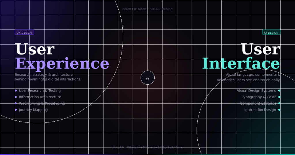
UX (User Experience) design and UI (User Interface) design are related but distinct disciplines. UX design is concerned with the overall experience of using a product — how it is structured, how users navigate it, how information is organised, and how tasks flow from beginning to end. It encompasses research, information architecture, wireframing, prototyping, and usability testing. UI design focuses on the visual and interactive layer — typography, color, spacing, iconography, micro-animations, and the specific appearance of each component.
In practice, UX comes first: you design the flow and structure before you design the pixels. All ten principles in this article are fundamentally UX principles — they govern decisions that happen before a single color is chosen. Many professional designers work across both disciplines (often called product design), but understanding that UX and UI solve different problems is essential for every beginner.
Yes — all three are empirically derived from peer-reviewed research and have been replicated across many studies. Hick’s Law originates from a 1952 paper by William Edmund Hick in the Quarterly Journal of Experimental Psychology. Fitts’s Law dates to Paul Fitts’s 1954 study on serial tapping performance, published in the Journal of Experimental Psychology. Jakob’s Law was articulated by Jakob Nielsen in 1999 and is grounded in decades of prior research on mental models and schema theory in cognitive psychology.
That said, these are models — not universal absolutes. They describe tendencies across large populations and can be affected by context, user expertise, task type, and domain. A professional software user navigating a complex IDE may not show the same Hick’s Law response as a first-time consumer app user. The laws are most useful as design heuristics: reliable guides to avoid common mistakes, not rigid formulas that predict exact outcomes in all situations.
Absolutely — and in several cases the principles apply even more strongly on mobile. Fitts’s Law is more critical on touch screens, where fingers are imprecise compared to a mouse cursor and accidental taps on small targets are common. Hick’s Law is more consequential on small screens, where every navigation item consumes precious viewport real estate. The principle of least effort matters more on mobile, where users are often in short sessions, multitasking, or in environments with interruptions. Jakob’s Law is amplified by the fact that mobile users have strong expectations built from the most-used apps (Instagram, WhatsApp, Maps), making unfamiliar patterns especially disorienting.
Visibility of system status is also particularly important on mobile, where network connectivity can be unreliable and users need to know whether their action was received, especially on slow or intermittent connections.
Start with a UX audit of one existing screen in your current project. Print it out or open it in a design tool and go through each of the ten principles: How many choices does the user face? (Hick) Are the interactive targets large enough and easy to reach? (Fitts) Does the layout follow familiar conventions? (Jakob) Are related elements visually grouped? (Gestalt) Is information chunked into digestible groups? (Miller) Are there unnecessary steps in the flow? (Least Effort) Can users tell at a glance what they can interact with? (Affordance) Does the interface communicate what is happening at all times? (Visibility) Are errors prevented, and are error messages specific and actionable? (Error Prevention) Are components and patterns consistent across screens? (Consistency)
Then run a usability test with just five participants — Nielsen’s research shows that five users uncover approximately 85% of usability issues. Watch them try to complete a core task without assistance. The violations they stumble on will immediately confirm or extend your audit findings, and you will have a prioritised list of improvements to make.
The most widely used tools for UX flows and journey maps in professional teams are Figma (with its FigJam whiteboarding tool), Miro, Whimsical, Lucidchart, and Mural. For higher-fidelity wireframes and clickable prototypes that incorporate the flows, Figma has become the industry standard as of 2025, with Adobe XD and Sketch still used in some teams. For user research and journey mapping with data, tools like Maze, UserTesting, and Dovetail help translate observed behaviour into structured insights that feed journey map creation.
A word of practical advice: do not let tool choice slow you down. A journey map sketched on a whiteboard and photographed is more valuable than a beautiful Miro template with no real user insight behind it. Start with whatever tools you already have, and invest in specialised tools only once you understand what problems they are solving for your workflow.
Yes, UX principles can and do conflict — and resolving those conflicts is where design judgment becomes essential. The most common tension is between Hick’s Law (fewer options are better) and Jakob’s Law (familiar patterns are better, even complex ones). A multi-level navigation with clear category groupings might be familiar to users of similar products, even if it technically presents more choices than a simpler layout. In this case, Jakob’s Law may outweigh Hick’s Law, because the familiarity reduces the cognitive cost of processing the options.
The resolution is always context-dependent: who are your users, how expert are they, what is their task context, and what does testing reveal? A complex enterprise application serving trained professionals can tolerate higher cognitive load and more options than a consumer app serving casual users. Always test with your actual users — general principles are starting points and guard rails, not verdicts that override empirical observation.
Understanding the principles in this article is a matter of hours. Internalising them — making them instinctive enough that you notice violations as you design, rather than after — takes roughly 50–100 hours of deliberate practice: designing screens, critiquing them against these principles, running usability tests, observing users, and iterating. That is roughly two to four months of consistent weekend practice or three to six weeks of full-time focus.
Becoming a genuinely skilled UX designer — one who can navigate ambiguous briefs, conduct thorough research, manage stakeholder expectations, and produce designs that consistently solve real problems — takes years. But the foundation built from mastering these ten principles will carry you through your first several dozen projects. Start here, apply what you learn to real work as quickly as possible, and build from there. UX, like most craft skills, is learned primarily by doing.
Start Applying These Principles Today
Mastering these 10 UX design principles — from the foundational UX laws of Hick, Fitts, and Jakob, to the perceptual science of Gestalt, to the practical craft of error prevention and consistency — gives you a mental toolkit for evaluating any interface with clarity and confidence. The best designers do not reinvent the wheel. They deeply understand why the wheel works, and they build on that foundation with intention.